Wednesday, March 16, 2022

Interface Design


We are easily frustrated when dealing with interfaces. Things get even tougher if we need to interface with a machine while others watch out of the corner of their eye—or while waiting behind us. Sometimes it is a good way to strike up a desperate conversation, perhaps proving people are generally kind.

Fundamentally, interface design requires discerning acceptable simplification. However, there is a limit on how much you can simplify a design—and you can never win— oversimplification irritates power users.

UX design “commandments” change every year as they strive to structure ideal approaches to human machine interfaces. The meaning of UX and the legion of other "U" acronyms also changes....

Designing interactions should pursue two categories of concerns: 1) simplify and 2) assist user.

1. Simplify

Keep designs consistent and minimalistic. Encourage familiarity by standardizing formats in graphics and text. Avoid unnecessary features and functions. Break complex tasks into manageable sub-tasks.

2. Assist User

Allow perception to drive prediction. Map the design so actions and responses are connected. Disable nonrelevant functions. Use motion to show where screens and information go. Relate to physical world. Remember things for the user, e.g. autofill. Detect and anticipate errors. Spell checker has been a sweet crutch for many of us.

Ok, I guess these are a bunch of “commandments” jammed into two….

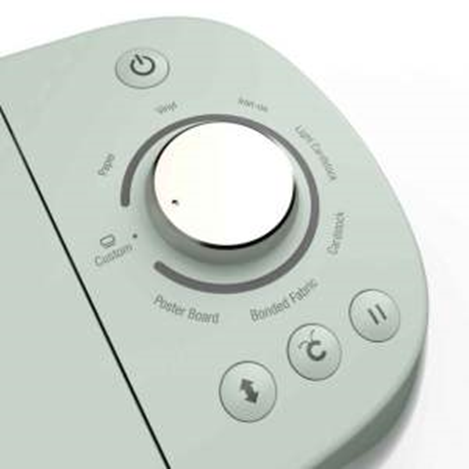
Here are examples of human-machine interface challenges from the non-digital world.

Washington DC Metro: Scary and confusing. Need tourist mode.


Cricut Cutting Machine: Manageable and sufficient